
Case study 01Imperial HealthcareAbu Dhabi / Dubai
Treated. Supported.Cared for, all the way home.
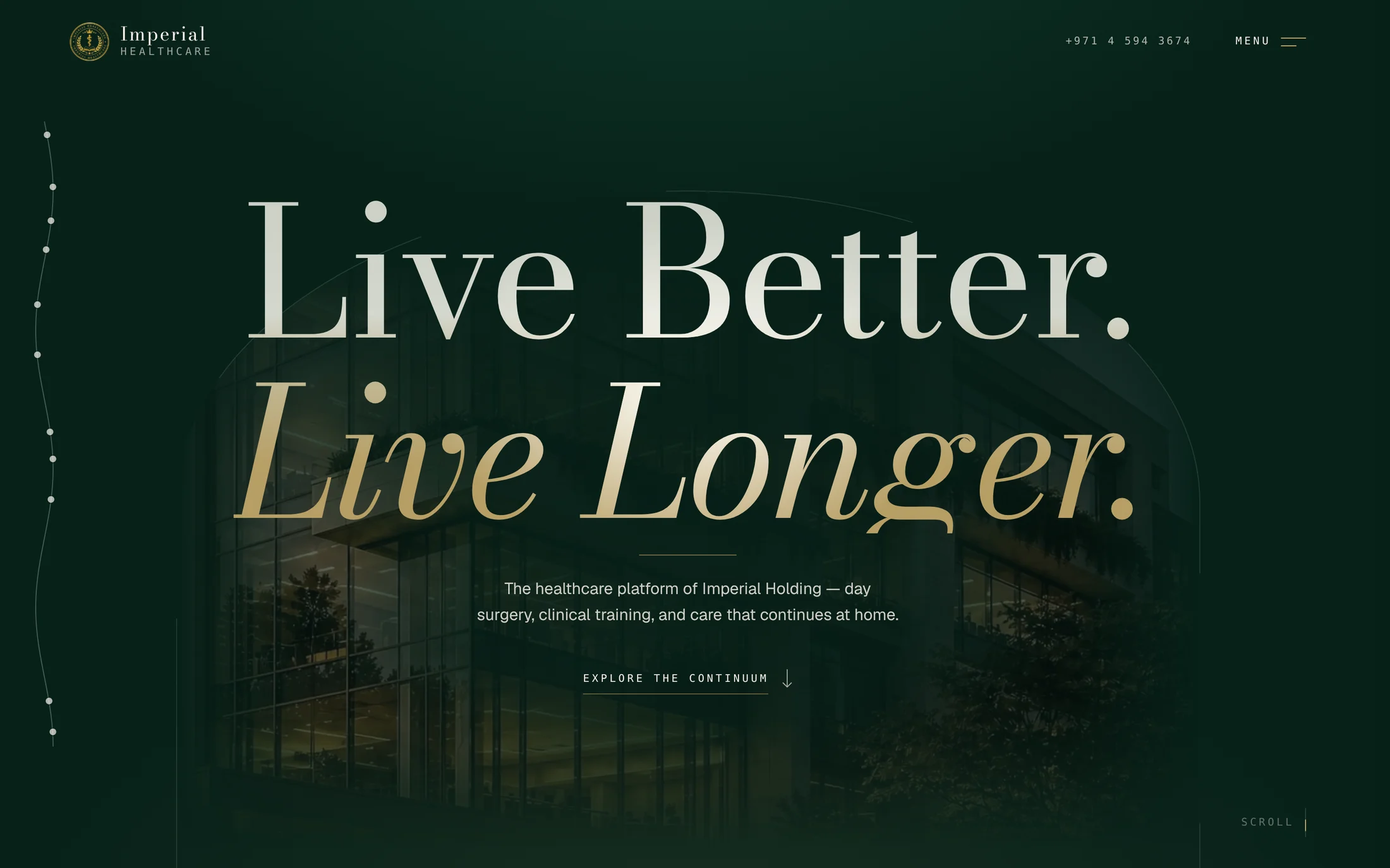
How a brand-new healthcare platform became credible to patients, doctors, insurers and investors, on a single page.
- Client
- Imperial Healthcare, part of Imperial Holding
- Scope
- Flagship site and a location page
- Role
- Design & Development
- Year
- 2026
Act one · Overview
A flagship site for a new healthcare platform.
Imperial Healthcare is the healthcare platform of Imperial Holding: a day-surgery hospital, a clinical training centre and home healthcare, in Abu Dhabi and Dubai.
I designed and built its flagship website, and the page for its Dubai location, Al Tadawi Medical Centre.
- Who it is for
- Patients, clinicians, insurers and investors
- What I did
- Web design, front-end development, motion
- Scope
- A one-page flagship site with eleven sections, and a location page
- Based in
- Abu Dhabi and Dubai
Act two · The problem
A new brand had to look established on day one.
Imperial Healthcare had no years of reputation for a visitor to look up. For a new name in healthcare, the website is the first thing people check, and often the only one. It had to do the convincing by itself.
- 01Nothing to check but the site.No history, no reviews, no familiar name. If the website looked like a template, the whole brand would look temporary.
- 02A great deal to fit on one page.Three units, facilities, specialties, insurers, training and a vision. Set out one after another, that becomes a catalogue nobody finishes.
- 03Every clinic site looks the same.Blue, white and a stock doctor. A premium private platform would disappear among them.
Act three · The approach
Make the site feel like the first building the brand opened.
A hospital earns trust by how it feels when you walk in: calm, finished, well made. I gave the site the same job. One idea holds all the content together, the look belongs to this brand alone, and nobody gets lost on a long page.
3.1Design
Three decisions that make a new name feel established.
Design decision 01of 03
One story to carry a long page.
- Why
- Eleven sections need a spine, or they read as a list. The spine is the continuum of care: the three units are shown in one pinned section that travels sideways, as stages of a single journey, under one sentence.
- What the client gets
- A visitor understands what Imperial Healthcare is within a few scrolls, and the rest of the page reads as detail on a story they already know.
Our modelThree frames from the same pinned section
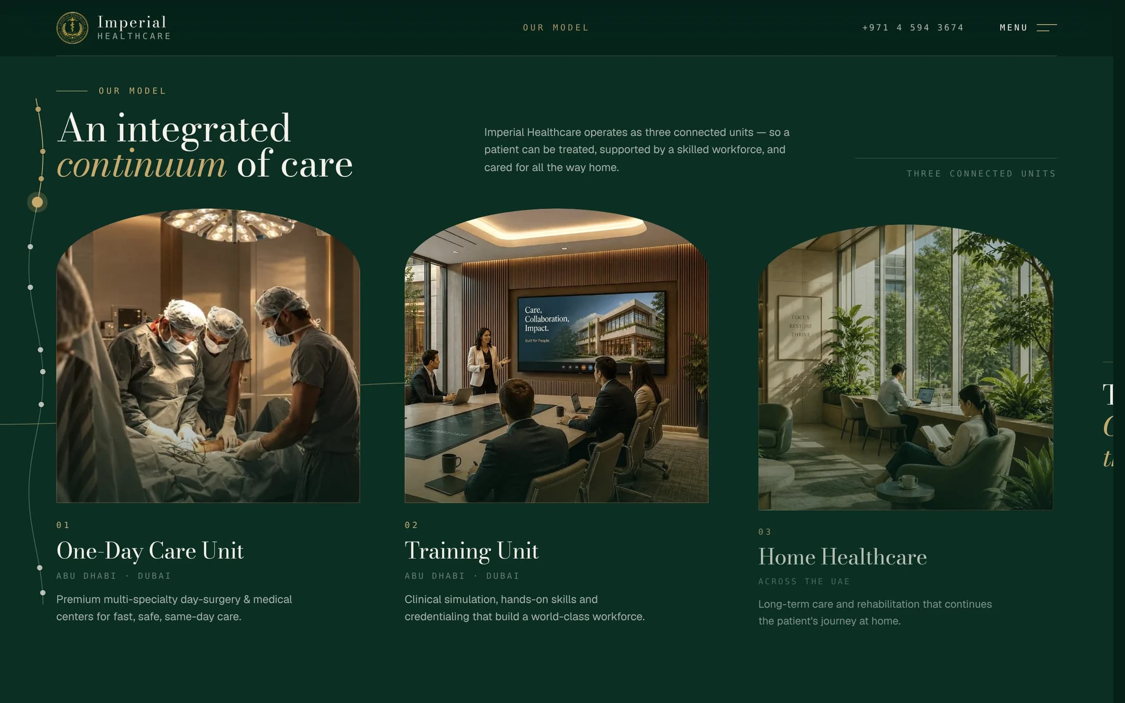
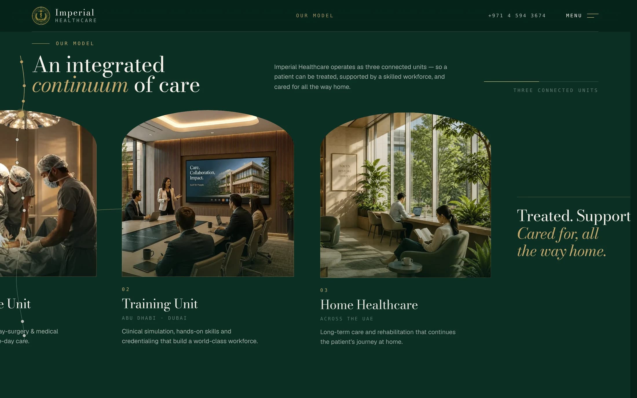
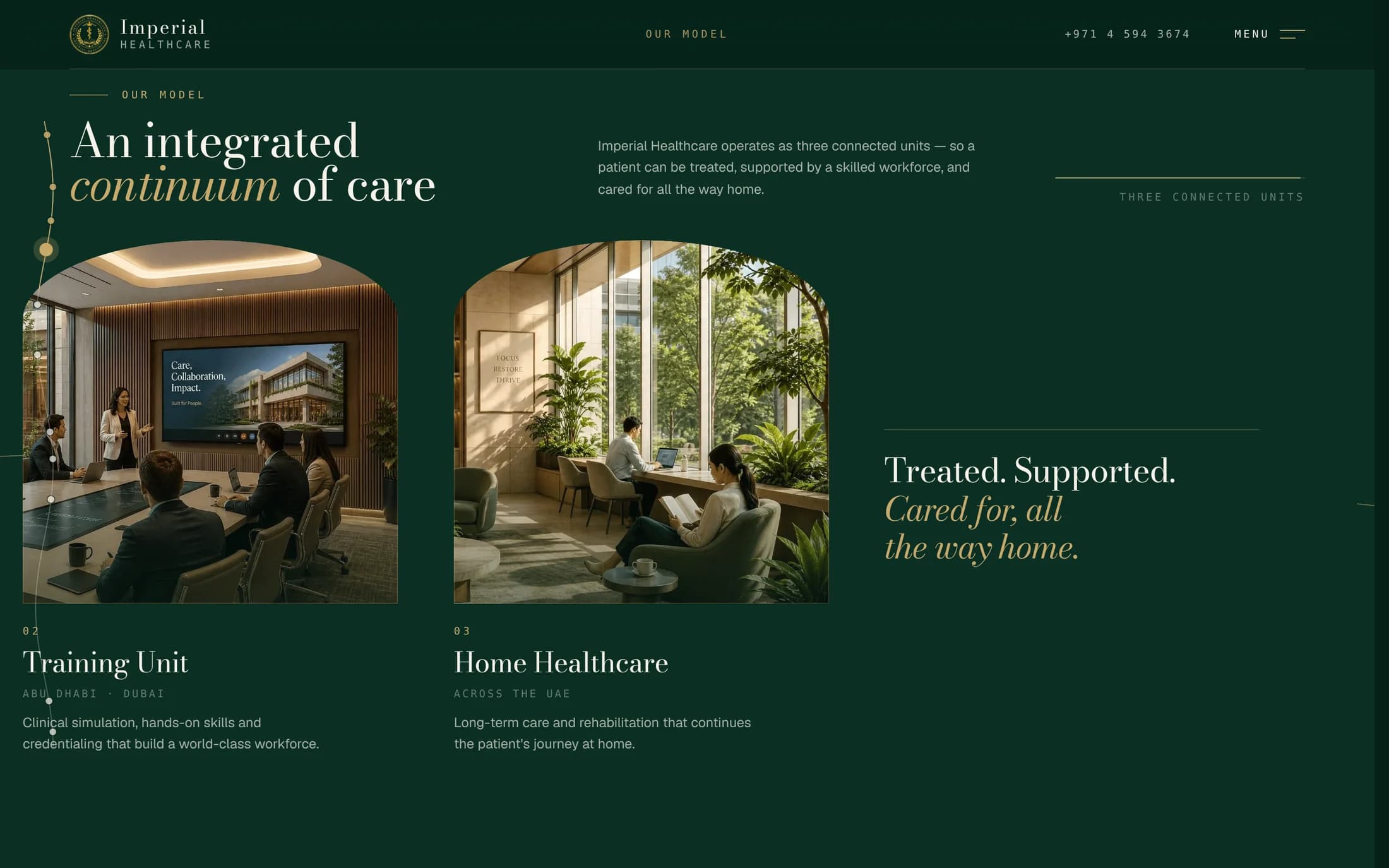
Treated. Supported. Cared for, all the way home.
Design decision 02of 03
A look no hospital site has.
- Why
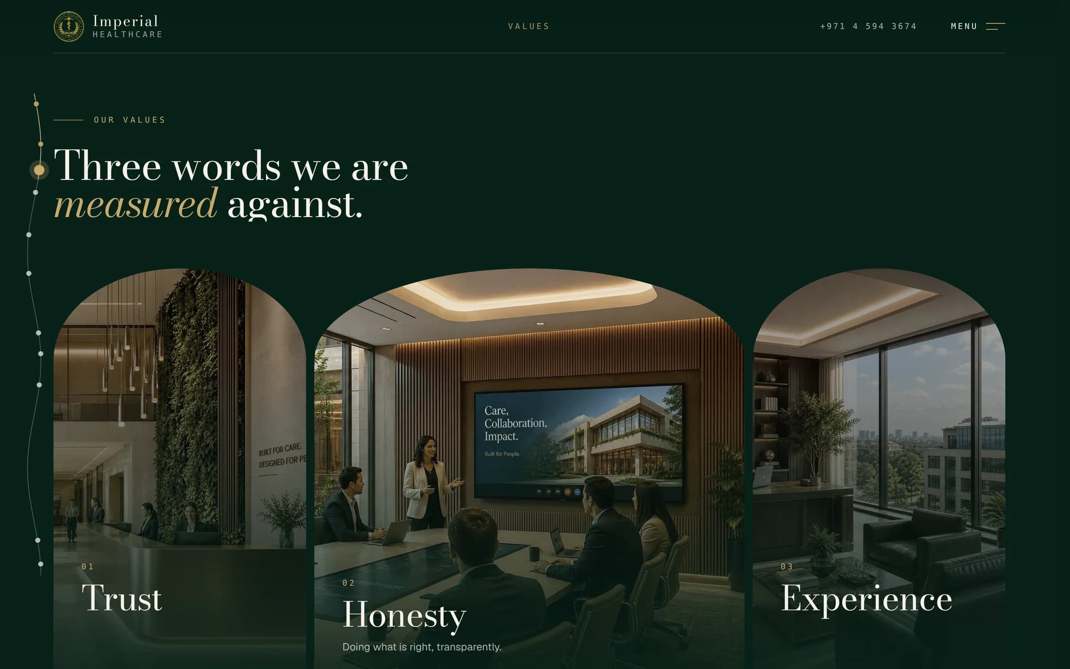
- A new brand can’t borrow recognition, so it has to be recognisable by itself. Dark emerald and gold replace hospital blue, and one shape, the arch, frames the hero, the galleries and the menu. The photographs are of the facility’s own rooms, so even the values are shown on real spaces.
- What the client gets
- The site reads as private, calm and premium before a word is read, and it can’t be mistaken for another clinic.
Design decision 03of 03
A menu that works as a map.
- Why
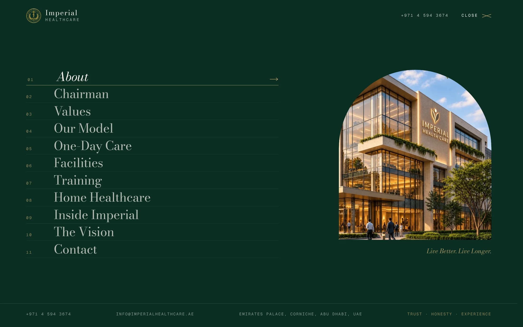
- The page is long on purpose, so nobody should have to scroll past ten sections to reach the one they came for. The full-screen menu lists all eleven, numbered, and each entry jumps straight to its section. The phone number stays in the header throughout, because in healthcare the decision ends with a call.
- What the client gets
- Any visitor is one click from their section and one tap from a person.
Colour and typePrivate, calm and considered
Colour
- Emerald
#062018The ground for every section that tells the story. Dark green reads as calm and private, closer to a good hotel than to a hospital corridor. - Gold
#c8a56aKept for the key words in a headline. It leads the eye to the promise in each sentence, and nothing else competes with it. - Cream
#f4eee3The background for facts and figures. When the page turns light, the visitor knows it is time to read numbers.
Type
- Bodoni ModaHeadlinesA high-contrast serif from fashion and editorial print. It sets the tone of considered, private care before any claim is made.
- GeistRunning textNeutral and very legible, so long passages about clinical services stay easy to read.
- Geist MonoLabels and figuresMonospaced numerals give counts and labels the exactness of a medical chart.
3.2Development
What I built.
The calm only holds if the page is technically sound. A heavy, animated page that stutters would undo everything the design sets up.
- Next.js
- React
- CSS Modules
- Pinned, scroll-driven scenes.The continuum and the gallery hold in place while their content moves with the scroll, on top of smooth scrolling.
- Fluid with 35 images.Images are optimised and loaded as they are needed, so the pinned scenes stay smooth on a page this heavy.
- A hero that reacts.A light follows the cursor and reveals the headline, and figures count up as their section arrives.
- Animated text everyone can read.Headlines split up for animation carry the full sentence as a label, so a screen reader gets one clean line.
- A phone version of its own.The same content in one column, without scroll-driven pinning, so the scroll is left alone on small screens.
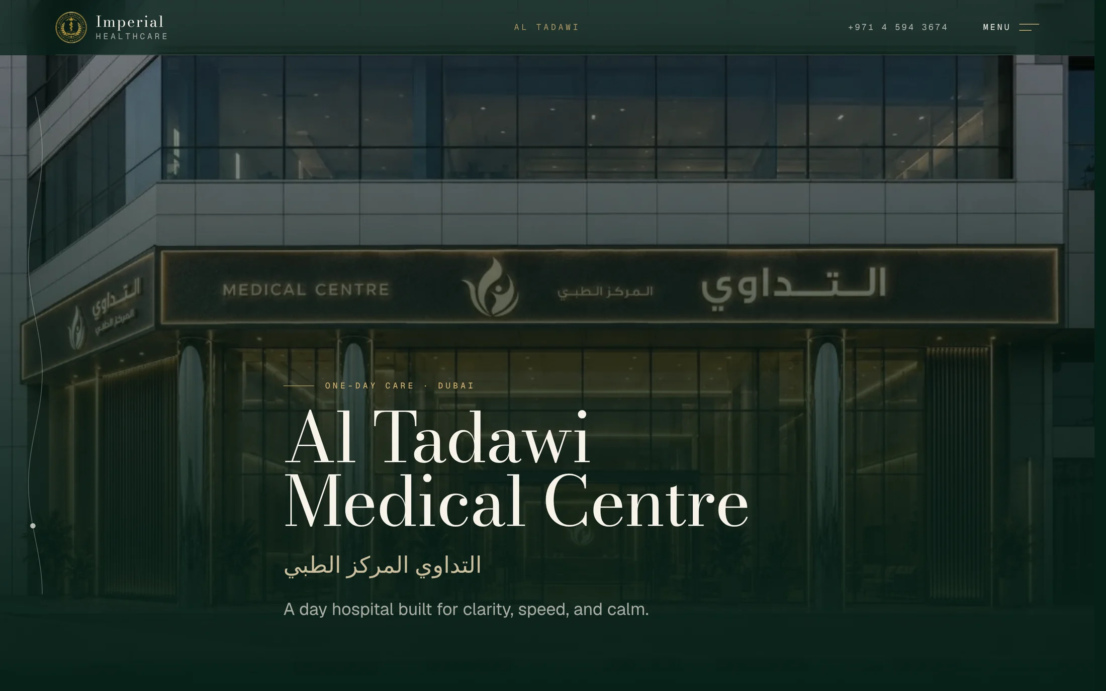
- A location page from the same parts.Al Tadawi Medical Centre in Dubai is built from the components of the main site, with its name in English and Arabic.
Act four · The results
What Imperial Healthcare has now.
A new name that looks like it has been here for years, and a site that can take the next location without being redesigned.
- 1Page that carries the whole platformThree units, facilities, insurers, training and vision, in one scroll with a story running through it.
- 11Sections, each one click from the menuNobody scrolls past ten things to reach the one they came for.
- 35Images, with scenes that stay smoothA rich page that still feels calm to scroll.
- +1Location page with no new designAl Tadawi Medical Centre went live on the same components.
| Without it | With the site | |
|---|---|---|
| First impression | A new name with nothing to check | A flagship site that looks established |
| Content | A long list of services and facts | One story in three stages, with the detail under it |
| Look | Hospital blue and stock photography | Emerald, gold, the arch and the facility’s own rooms |
| Growth | A new design for every location | A location page built from the same parts |