
Case study 03KRST, Conservative Reformist Party
A site that answers three questions in ten seconds.
The digital identity of a political party, from the symbol of the cross to a programme of one hundred points.
- Client
- KRST, Serbia
- Type
- Multi-page site in Cyrillic, Latin and English
- Role
- UX/UI Design & Front-end
- Focus
- Trust, verifiability, joining
01Overview
KRST, the Conservative Reformist Party, needed a website before an election: one place where a voter, a journalist or a possible member could find out who the party is and what it wants.
I designed the site and built its front end, in Serbian Cyrillic, Serbian Latin and English.
- Who it is for
- Voters, journalists, and people thinking of joining
- What I did
- UX and UI design, front-end development
- Pages
- Home, party, programme, president, vice-president, statements, video, join
- Languages
- Serbian in Cyrillic and Latin, and English
02The problem
A voter gives a party site ten seconds.
People land from a shared link or a search with one of three questions: who is this, what do they stand for, and what should I do. If the first screens don’t answer, they leave. With an election coming, every visitor lost is a vote or a member lost.
- 01No answer to “who are you”.A party site usually opens on a feed of news in no order. The visitor can’t tell what matters, and leaves without learning who is behind it.
- 02A programme nobody opens.It sits in a PDF: hard to read on a phone, impossible to link to, invisible to search. The strongest argument the party has stays unread.
- 03Claims nobody can check.Statements and figures come with no source, so a journalist can’t use them and a doubtful voter has no reason to believe them.
03The approach
Three questions, each answered on its own screen.
I stopped treating it as a party website and treated it as three answers in a fixed order. Every decision below exists to make one of those answers faster to find or easier to believe.
3.1Design
One decision for each question.
Design decision 01of 03
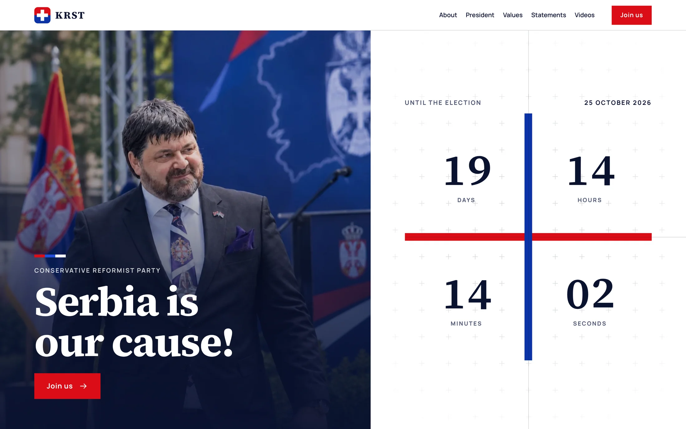
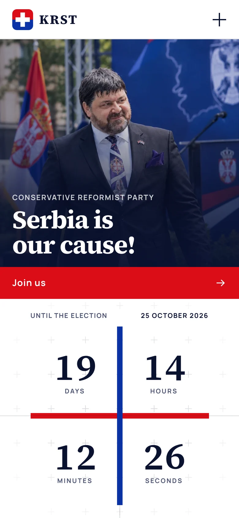
Who are they? A face, a date and a symbol.
- Why
- “Who are these people” is answered fastest by a person, so the president is the first thing a visitor sees. Beside him a countdown runs to election day, split into four fields by a red line and a blue line: the party’s cross. The same cross comes back as the pointer in the values and behind the call to join.
- What the client gets
- Within seconds a visitor knows who leads the party and when the vote is. And every screen is recognisable as KRST, even as a cropped screenshot passed around on a phone.
Design decision 02of 03
What do they stand for? Read it, then check it.
- Why
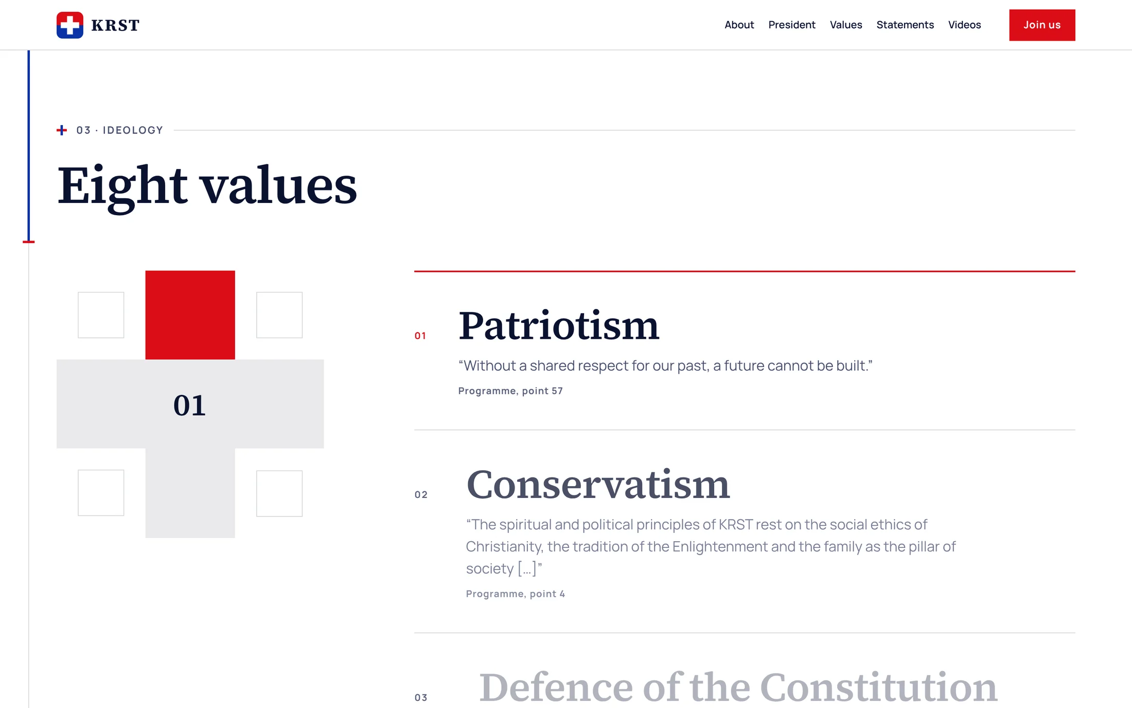
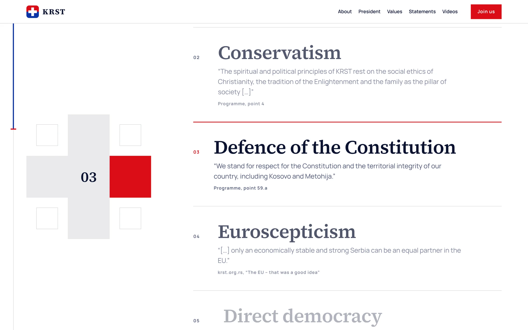
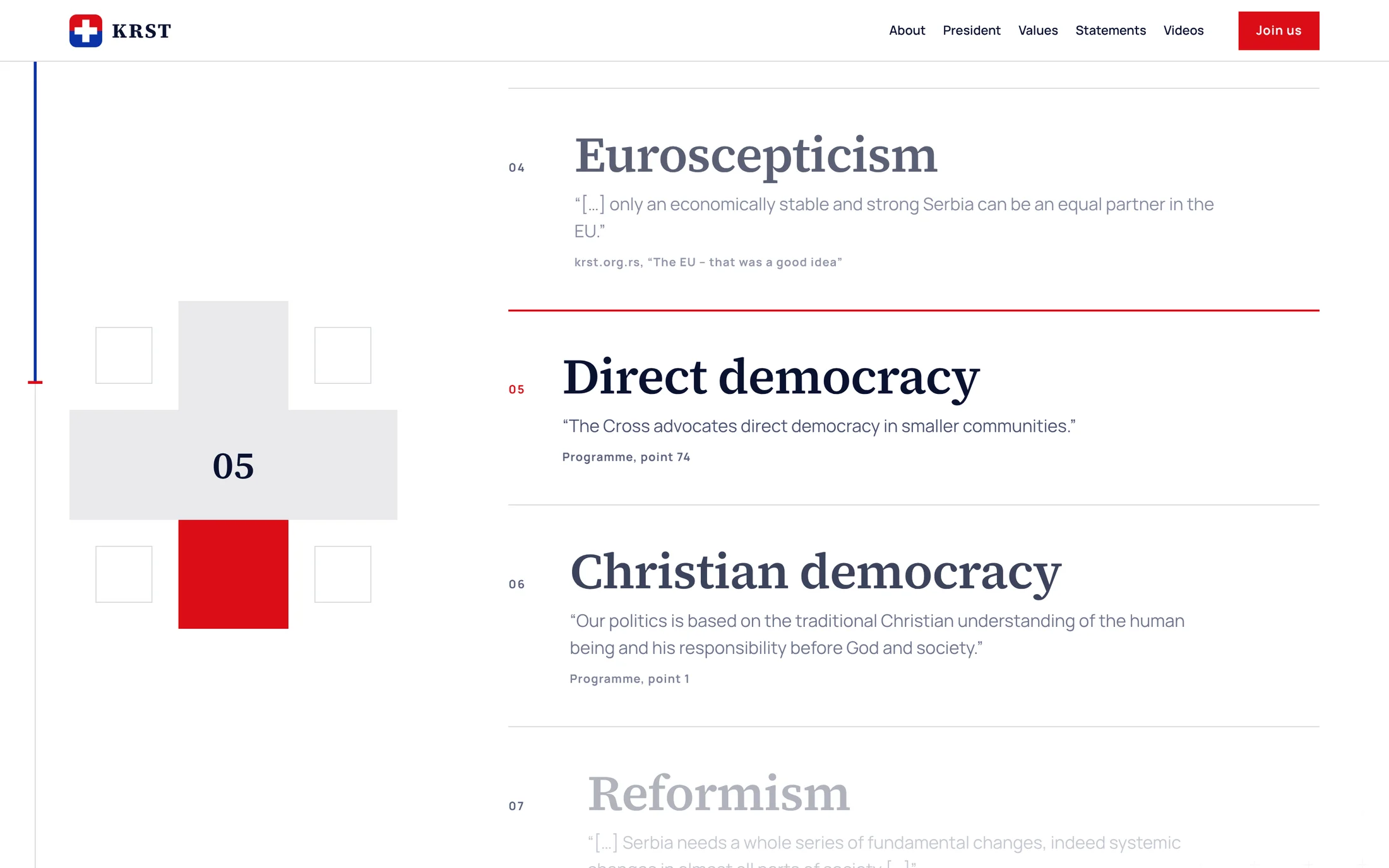
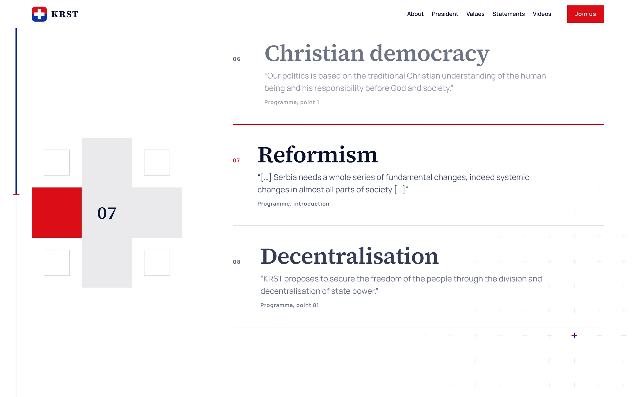
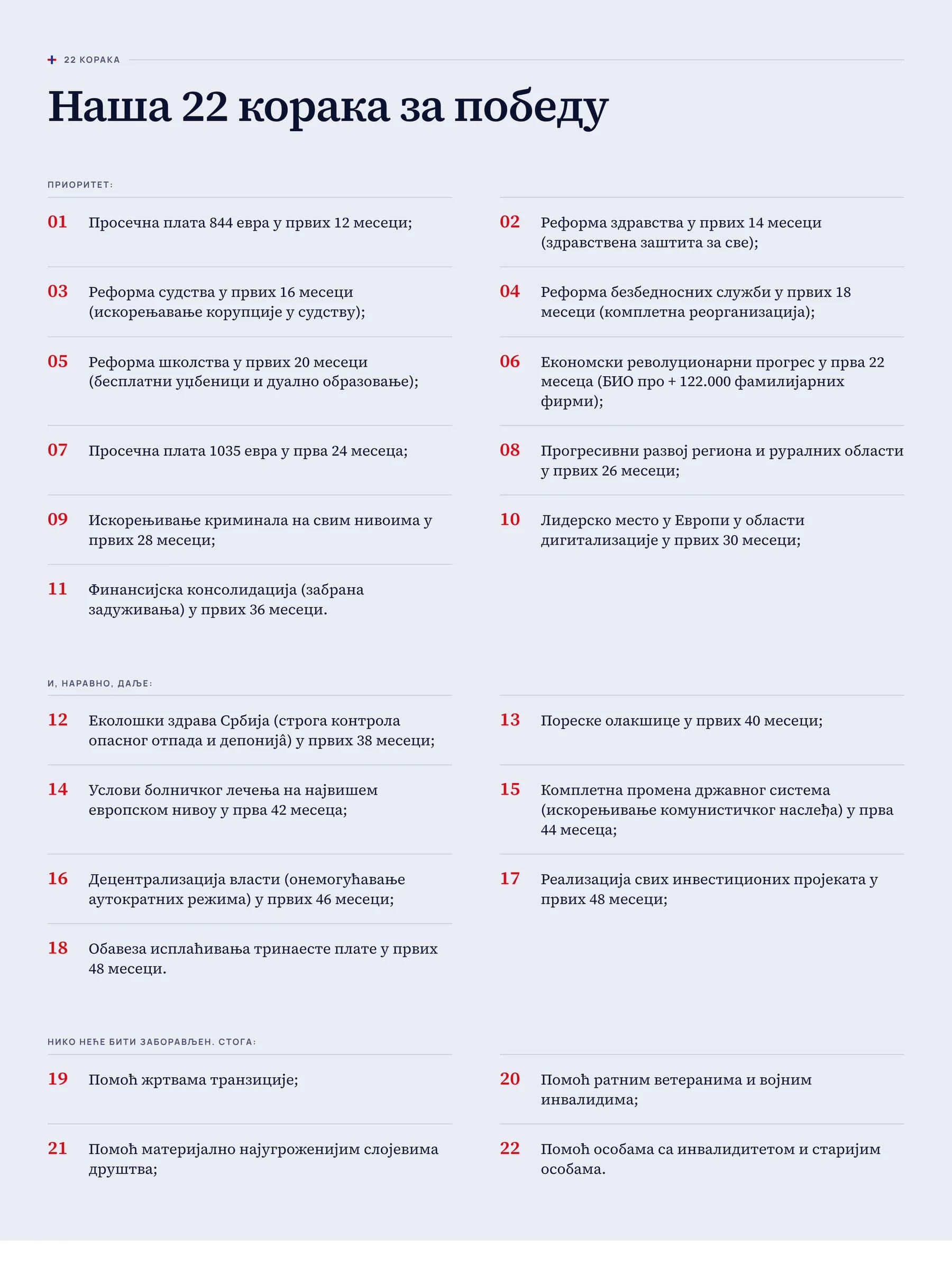
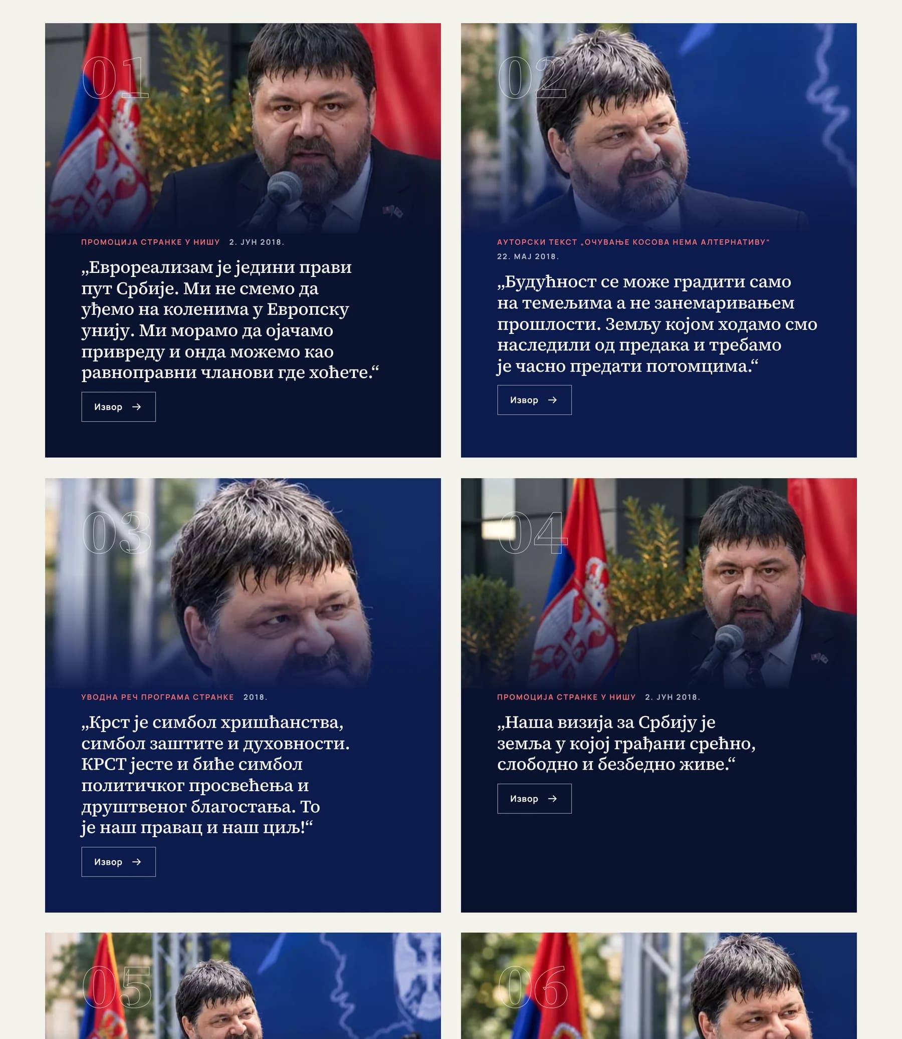
- This is where trust is won or lost. A list of eight values gets skimmed, so the section holds still and shows one value at a time, each with a quotation. The programme is web text that opens with 22 steps and their deadlines, not a PDF. And every statement has a Source button beside it.
- What the client gets
- A voter understands the party in a minute, a journalist can link to one exact point, and a sceptic can check any claim. That is worth more than a slogan.
From the live siteKeep scrolling
The scroll walks the visitor through the values.
The cross shows the number of the active value and one of its arms turns red. The active entry grows dark and large, and the rest fade.
Design decision 03of 03
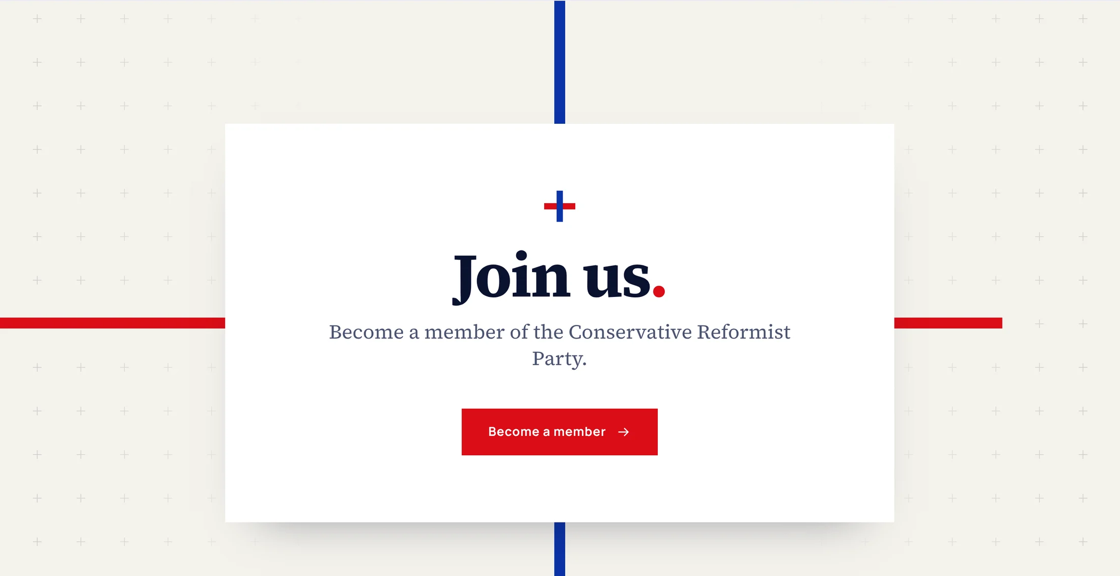
What should I do? Red means one thing: join.
- Why
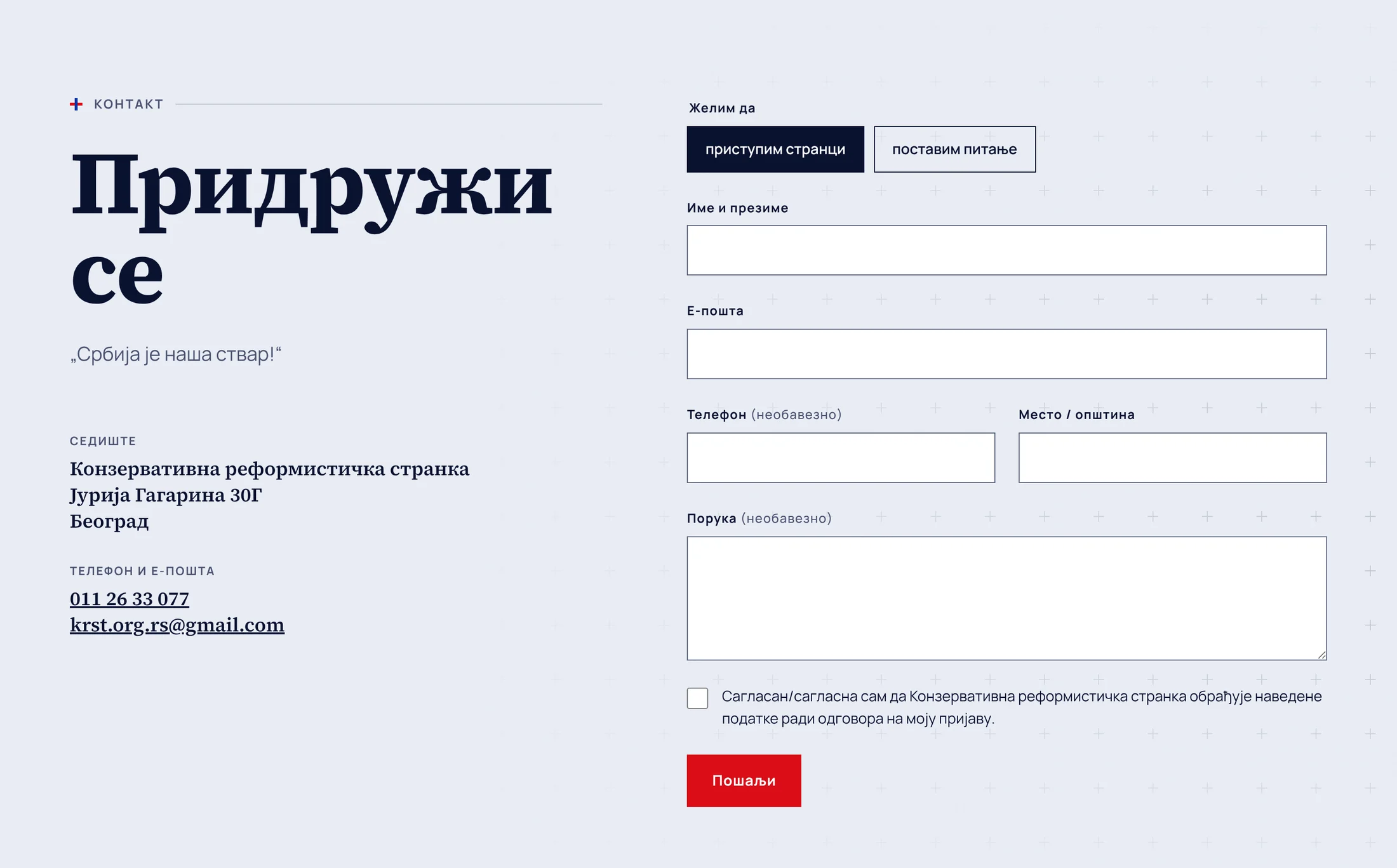
- If red is everywhere, nothing is the main action. It is kept for the Join button, which sits in the header, in the hero, at the end of every page and in the footer. The form asks for four fields, because every extra field loses people, and on a phone the button spans the full width.
- What the client gets
- From any page, membership is one tap and four fields away. With an election date on the calendar, that had to be the shortest path on the site.
Colour and typeBorrowed from things people already trust
Colour
- Navy
#0a1030Steady and official. Laid over photographs, it makes pictures from different years look like one set. - Red
#e0121bAction only: the Join button and one arm of the cross. Because it appears nowhere else, the eye goes straight to it. - Blue
#1a3fc0The second arm of the cross. With the red it gives the national colours without a flag on every page. - Paper
#f3f2eeThe background for long reading. A warm off-white is easier on the eyes than pure white over thousands of words.
Type
- Source Serif 4HeadlinesA serif carries the weight of print: newspapers, law, institutions. It says this is a party with a written programme, not a campaign page.
- ManropeRunning textOpen, even letters that stay clear at small sizes in both Cyrillic and Latin. The same page has to read well in three scripts.
3.2Development
What I built.
The design only works if the page is fast, readable in three scripts and easy for search engines to understand. This is what sits under it.
- Next.js
- React
- Three scripts from one site.Cyrillic, Latin and English are separate pages, tagged so that search engines show each reader their own version.
- A live countdown.The clock to election day runs in real time, with digits that roll like an odometer.
- The scroll-driven values section.The cross stays in place and tracks the active value while the list moves under it.
- The programme as structured text.One hundred points, 22 steps and seven goals as real headings and lists, readable on a phone and indexable by search.
- A membership form that respects the visitor.Four required fields, a choice between joining and asking a question, and explicit consent for data processing.
- Search and accessibility basics.Each page has its own title, description and structured data, with a skip link and semantic landmarks throughout.
04The results
What the party has now.
A site where the three answers sit on the first screens, the programme is text anyone can read and quote, and joining takes four fields.
- 3Questions answered on the first three screensWho they are, what they stand for, and what to do next.
- 100Programme points as readable web textEach one can be linked to, quoted and found through search.
- 8/8Statements with a sourceEvery card has a Source button next to it.
- 4Fields to become a memberReachable from the header on every page, in all three scripts.
| A typical party site | KRST | |
|---|---|---|
| Who they are | A feed of news | The president, the party’s facts and the election date on the first screens |
| Programme | A PDF in a drawer | Web text, 22 steps with deadlines up front |
| Trust | Claims with no way to check them | A source next to every statement |
| Membership | A form buried in the site | One red button in the header, four fields |
Live project
See it live.
Three questions, answered in ten seconds. See how it reads on your own screen.
Visit kr-st.org